
The origin of
the idea that hachure, closely spaced, parallel thin lines, used to fill a
space might be intended to symbolize the color blue was credited to J. J. Brody
by Stephen Plog (2003). “One of the common design characteristics on black-on-white
pottery from the eleventh and twelfth centuries in the northern American
Southwest is the use of thin, parallel lines (hachure) to fill the interior of
bands, triangles, This essay explores a proposal offered by Jerry Brody that
hachure was a symbol for the color blue-is examined by exploring
colors and color patterns used to decorate nonceramic material from the of
northwestern New Mexico. His proposal is supported and the implications of this
conclusion for future studies of this nature are discussed.” (Plog 2003:1) This suggestion, originally applied to the
decoration of pottery, was because while the indigenous potters had a full
range of black, white, reds and yellow based upon natural pigments, there was
no technology at that time that could give them blue or green colors on
finished pots. But Plog had also compared the use of hachure on pottery to
other, non-pottery, painted artifacts and decided that hachure was used on
pottery designs in the same manner that blue paint was used on other media.

Sarah Klassen and Will Russel, in 2019, explained it in a paper on color usage in Mimbres pottery. “In the 1970s, American art historian Jerry “J.J.” Brody speculated that 11th- and 12th-century potters in the Chaco region of what is today New Mexico used black hachure—closely spaced, parallel lines—on a white background as a proxy for the color blue-green. The Chaco culture was centered on Chaco Canyon, but it spanned the Four Corners area of Utah, Colorado, Arizona, and New Mexico. Brody had noticed some striking similarities between black-on-white designs on pottery and more colorful designs in other media, such as stone mosaics and painted boards, where color was easier to apply and longer-lasting. The designs were similar, but where the mosaics had turquoise, the pottery had hachure. In 2003, archaeologist Stephen Plog of the University of Virginia tested this idea, comparing the use of hachure on pots to the use of blue-green on more than 50 objects featuring color. His findings supported Brody’s idea: Hachure seemed to represent turquoise.” (Klassen and Russell 2019:3)
Interestingly,
Will G. Russell, Sarah Klassen and Katherine Salazar, having done their own
comparative study, had written in 2017 that “Our observations do not support the hypothesis that Mimbres hachure
acted as a proxy for blue-green. If such an association did exist, it would
make little sense for potters to use hachure interchangeably with any color
other than blue-green. That is, if hachure did represent blue-green, it follows
that it would either stand alone, or be stylistically interchangeable with
blue-green. Although blue-green pigment would not have stayed blue-green after
firing, it could have been added as fugitive paint. Thus, if our comparison
suggests any correlation between Mimbres hachure and a particular color, that
color is either brown (objective) or yellow (subjective).” (Russell,
Klassen and Salazar 2017:115) So, their interpretation, although their
conclusions differ from Brody and Plog, also find hachure to represent a color.

We
also need to keep in mind that what may have applied to art produced by the
Mimbres Culture would not necessarily apply to the other prehistoric cultures
of the American Southwest. As we have seen, however, Brody and Plog had come to
the conclusion that for prehistoric Puebloan (Anasazi) peoples the use of
hachure, in Chaco Canyon and elsewhere, stood for the color blue. Indeed, Plog
had focused his study on Chacoan pottery.

So
what does all this talk about pottery have to do with rock art? Well, we find
some examples of hachure or hachure-like texturing in rock art. Also we need to
remember that colors pretty much always had major spiritual significance to
indigenous peoples.

“Most of the Pueblos associate north
with yellow, west with blue, south with red, and east with white. Below, or the
underworld is generally associated with black or dark, while the zenith, or the
world above, is variably represented by black, brown, yellow or multiple
colors.” (Munson
2020:13) So, the colors on a pot, or the color of the paint used to make a
pictograph may have carried extra meaning associated with the spiritual
implications of the color. Based on the seeming ubiquity of these color codes
in the American Southwest, I am going to assume that the peoples on the
northern periphery, first Barrier Canyon and later Fremont, also gave colors of
paint a spiritual content, I just have no way of knowing for sure what those
meanings would be.
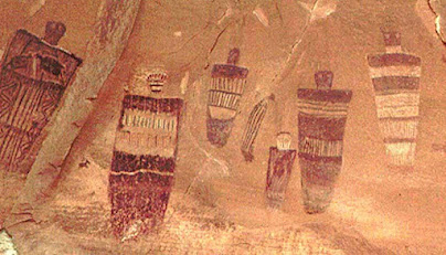
Most
painted rock art is in various shades of natural ochers although there are rare
examples of blue and green. In Barrier Canyon Style (BCS) figures (and
presumably Fremont Culture figures as well) Dr. James Farmer (2019) associated
vertical hachure within the silhouette of the figure as representing rain. One
of the elements of his “BCS
‘Thunderstorm’ Iconographic Complex” is falling rain shown on an
anthropomorph as closely spaced vertical lines – hachure? Although painted with
red paint, he says they represent falling rain, and rain is water and water is
associated with blue. What if those hachure rain lines in Barrier Canyon
anthropomorphs represent blue rain? What if the artists who painted the figures
used closely spaced red lines (hachure) to represent the color blue on the
figures?
I
don’t think I could prove this even if I wanted to, and I am not convinced even
now, but isn’t it an interesting possibility?
NOTE: Some images in this posting were retrieved from the internet with a search for public domain photographs. If any of these images are not intended to be public domain, I apologize, and will happily provide the picture credits if the owner will contact me with them. For further information on these reports you should read the original reports at the sites listed below.
PRIMARY REFERENCES:
Farmer, James, Dr., 2019, Southwestern Rock Art and the Mesoamerican Connection, 18 April
2019, Colorado Rock Art Association online webinar.
Klassen, Sarah, and
Will Russell, 2019,
The Hidden Color Code in Mimbres Pottery,
14 November 2019, https://www.sapiens.org/archaeology/mimbres-pottery-color/.
Accessed
online 6 March 2025.
Munson, Marit K., and Kelley
Hays-Gilpin,
editors, 2020, Color in the Ancestral
Pueblo Southwest, University of Utah Press, Salt Lake City, UT.
Plog, Stephen, 2003, Exploring the Ubiquitous Through the Unusual: Color Symbolism in Pueblo
Black on White Pottery, October 2003, American Antiquity, Volume 68 (4),
pp. 665-695. Accessed online at JSTOR, 7 March 2025.
Russell, Will G.,
Sarah Klassen and Katherine Salazar,
2017, Lines of Communication: Mimbres
Hachure and Concepts of Color, American Antiquity 83 (1), 2018, pp.
109-127. Accessed online at Researchgate, 7 March 2025.
SECONDARY REFERENCE:
Brody, J. J., 1991, Anasazi and Pueblo Painting, A School of American Research Book,
University of New Mexico Press, Albuquerque, New Mexico.


No comments:
Post a Comment